


How to Identify High Quality Engraving
Last Updated: October 25, 2026
Quick Summary
High quality engraving means clean, permanent marks with sharp lines, even depth, and no rough edges, smudging, or fading. Text reads clearly, logos look professional, and the mark lasts for years without deteriorating.
- Inspect clarity by checking that all letters are fully formed, edges are clean, and small text under 8 point size remains readable at arm's length.
- Run your finger across the engraved area; high quality engraving feels smooth with uniform depth, not rough or splintered.
- Use a 10x magnifier to examine edge quality and a depth gauge to measure consistency across three or more points on the design.
- Laser engraving offers superior precision with controllable depth and sharp fine lines compared to etching methods.
- Match inspection tools to your question: eyes for legibility, magnifier for edges, depth gauge for consistency, and raking light to reveal burrs and texture variation.
Table of Contents
- What High Quality Engraving Actually Looks Like
- Visual Quality Assessment Checklist for High Quality Engraving
- Laser Engraving vs. Etching: How Each Affects Quality
- Engraving Depth and Consistency: What to Inspect
- Material-Specific Quality Standards
- Best File Format for Engraving and Its Impact on Quality
- Common Engraving Defects and How to Spot Them
- Inspection Tools and Techniques for Repeatable Testing
- Frequently Asked Questions
What High Quality Engraving Actually Looks Like
High quality engraving means clean, permanent marks: sharp lines, even depth, and no rough edges, smudging, or fading.
Text reads clearly, logos look professional, and the mark lasts for years.
At Lil Legacy Treasures, we create personalized gifts where the engraving is as beautiful as the item itself. The difference between ordinary and exceptional work comes down to precision, material knowledge, and execution.
Visual Quality Assessment Checklist for High Quality Engraving
A visual quality assessment checklist helps you evaluate whether an engraved piece meets professional standards. You don't need special equipment, just your eyes.
Clarity and Legibility Standards
Clarity means you can read every letter and number without squinting; legibility means the text looks intentional.
Check these elements:
- All letters and numbers are fully formed and complete
- No broken or incomplete lines in the design
- Text spacing is even throughout
If you struggle to read the text, that's a red flag. High quality engraving stays legible even in low light.
Surface Finish and Mark Consistency
Surface finish is how smooth the engraved area feels and looks; consistency means every part of the design matches.
Run your finger across the engraved area: high quality engraving feels smooth, not rough or splintered, with uniform depth. Inconsistent depth looks amateur.
Look for these signs of quality:
- No burrs or rough edges around the engraved lines
- Consistent color or tone throughout the mark
- No visible tool marks or scratches outside the design
Laser Engraving vs. Etching: How Each Affects Quality
Laser engraving and etching produce different results, so understanding the difference helps you choose the right method for your material. Learn how engraved gifts differ from monogrammed gifts and other personalization techniques.
Laser engraving uses heat to vaporize the surface with a precise beam that allows fine detail and small text.
American National Standards Institute guidelines on laser safety provide standards for laser marking equipment. Different materials respond differently to laser engraving.
For high quality engraving, laser methods offer superior precision and consistency: depth is controllable and repeatable, fine lines stay sharp, and small text stays legible.
Engraving Depth and Consistency: What to Inspect
Engraving depth affects appearance and durability: too shallow and the mark fades; too deep and it can damage delicate materials or look crude.
Inspect depth consistency by tilting the piece under light from different angles; darker or lighter sections mean inconsistent depth.
Signs of proper depth:
- The mark is visible from across the room
- Running your finger over it, you feel a clear difference
- The mark doesn't disappear in certain lighting
Shallow engraving is a common defect, often indicating rushed production or improper settings. Avoid pieces where the mark is barely felt or only visible in bright light.
Material-Specific Quality Standards
Different materials require different engraving approaches; what looks perfect on wood may be inadequate on metal. Discover how to personalize keepsake gifts with proper engraving techniques for lasting quality.
Wood Engraving Quality Indicators
Wood engraving should create clear color contrast; heat darkens the wood, making the mark obvious and permanent.
Quality wood engraving shows:
- Dark, crisp lines with no charring or burn marks beyond the design
- Clean edges where the engraved area meets the unengaved wood
- No splintering or raised grain around the mark
Wood grain affects appearance, and engraving across the grain may look slightly different than with it.
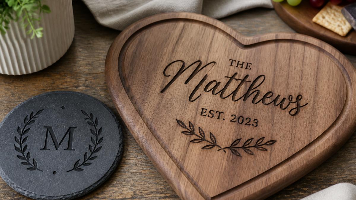
The Legacy Luxe Personalized Heart Charcuterie Board demonstrates proper wood engraving standards: sharp, readable text, consistent depth across the design, and an undamaged surrounding surface.
Legacy Luxe Personalized Heart Charcuterie Board →

Metal and Stone Engraving Expectations
Metal engraving creates contrast through surface texture rather than color change; the engraved area appears lighter or polished, which is normal and desirable.
For metal engraving, look for:
- Smooth, polished appearance in the engraved area
- Sharp, defined edges between the mark and the base metal
- No discoloration or oxidation in the engraved lines
Stone and slate engraving works through surface texture changes: the engraved area appears lighter because it exposes fresh stone beneath the weathered surface.
Quality slate engraving shows:
- Clear, readable text with sharp edges
- Consistent depth throughout the design
- No visible tool marks or scratches
The Legacy Luxe Personalized Slate Coaster Set for Dad exemplifies proper stone engraving: clean, permanent marks, legible text, and consistent depth across all four pieces.

Best File Format for Engraving and Its Impact on Quality
The file format you submit affects final quality. Vector files (SVG, PDF) beat raster files (JPG, PNG) because they describe lines mathematically rather than as pixels.
Vector files stay sharp at any size; raster files lose detail when enlarged, so a low-resolution image engraves pixelated or rough.
Best practices for file submission:
- Use vector formats (SVG, PDF, AI) whenever possible
- Ensure minimum line width is at least 0.5mm for laser engraving
- Verify text is at least 6-8 point size for readability
If you're ordering a personalized gift, ask about file requirements before submitting your design. A reputable engraver will guide you toward formats that ensure quality results.
Common Engraving Defects and How to Spot Them
Most engraving guides list defects without teaching you how to diagnose them. A defect-to-cause approach is more useful: observe what the mark looks like, then work backward to the likely process failure.
Examine the piece under raking light (a light source held at a low angle), which exaggerates surface texture and reveals depth variation, burrs, and residue that diffuse overhead light hides.
Defect-to-Cause Diagnostic Guide
Use the table below to match what you see to the most likely cause. Causes are listed from most to least common for that appearance.
| What you see | Likely cause | What it means for quality |
|---|---|---|
| Fuzzy or blurred edges | Incorrect focus or focal distance; motion during marking; low-resolution raster artwork | The mark will look soft and may not hold fine detail; reject if text edges are not clean at 10x |
| Scorching or dark halo beyond the design | Excessive power, too-slow speed, or insufficient air assist on laser systems | Heat damage extends past the intended mark and can weaken thin materials; a light halo may be acceptable on wood, a heavy halo is not |
| Uneven depth across the design | Inconsistent power delivery, uneven material thickness, or warped stock | Some areas will wear faster than others; check depth at three or more points with a depth gauge |
| Weak or washed-out contrast | Underpowered settings, wrong wavelength for the material, or surface contamination before marking | The mark may be legible now but fade with cleaning; verify contrast under both daylight and low light |
| Residue or smudging in and around the mark | Incomplete exhaust or extraction, or no post-process cleaning | Residue can obscure detail and may transfer to hands; a cleanable film is acceptable, a baked-on film is not |
| Chipped or splintered edges on wood | Excessive power, high moisture content, or dull rotary tooling | Splintering weakens the mark and looks amateur; small raised grain is normal, torn fibers are not |
| Jagged or blocky small text | Raster artwork used instead of vector; insufficient resolution | Fine detail is lost permanently; this is an artwork problem, not a machine problem |
| Double or ghosted lines | Workpiece movement, belt backlash, or a second pass that did not register | Registration errors are visible at 10x and indicate the process was not controlled |
| Discoloration or oxidation in metal marks | Heat input too high, or reactive cleaning chemicals left on the surface | Can indicate corrosion risk over time; check whether the discoloration is surface-only or into the mark |
Setting Acceptance Tolerances
A defect is only a defect if it exceeds an agreed tolerance. Before you accept a piece, define pass/fail criteria in writing. Practical starting points that most professional shops can meet:
- Legibility: All characters readable at arm's length under normal indoor lighting, with no broken strokes.
- Edge quality: At 10x magnification, edges are continuous and free of fraying or double lines.
- Depth consistency: Depth measured at three or more points varies by no more than roughly 10 percent on the same material and design.
Where Defects Hide
Defects cluster in predictable places. Check the edges and corners of the design first, because equipment acceleration and deceleration happen there and often produce deeper or shallower marks.
Inspection Tools and Techniques for Repeatable Testing
Repeatable testing means using the same tools, lighting, and pass/fail criteria every time so two pieces can be compared fairly. The goal is to convert "this looks good" into "this meets these measurable criteria."
Choosing the Right Tool for the Check
Match the tool to the question you are asking; the wrong tool wastes time and produces false confidence.
| Check | Tool | Why it works |
|---|---|---|
| Overall legibility | Your eyes at arm's length under normal indoor light | Matches how the piece will actually be viewed |
| Edge quality and fine detail | 10x magnifier or a loupe | Reveals fraying, double lines, and residue invisible to the naked eye |
| Depth variation | Depth gauge or a dial caliper with a depth rod | Converts a subjective feel into a number you can compare |
| Line width and spacing | Calipers or a steel rule with 0.5 mm graduations | Detects drift in line width across the design |
| Surface texture and burrs | Raking light plus fingertip | Raking light exaggerates texture; touch confirms what light suggests |
| Contrast | Daylight and dim-light comparison | A mark that only reads in bright light will fail in real use |
| Documentation | Camera with flash and a scale reference | Creates a record you can revisit and compare across batches |
A 10x magnifier is sufficient for most inspection. Higher magnification (20x to 30x) helps judge edge quality on very fine text but exaggerates harmless surface texture, so use it as a secondary check.
A Repeatable Inspection Sequence
Run the same sequence every time, in the same order, so results are comparable across pieces and batches:
- Visual pass at arm's length under normal indoor lighting. Record legibility as pass or fail.
- Raking-light pass to reveal depth variation, burrs, and residue.
- Magnification pass at 10x on the smallest text and on design edges.
- Depth measurement at three or more points using a depth gauge or caliper depth rod. Record each reading.
- Contrast check under dim light to confirm the mark remains readable.
- Photograph the piece with a scale reference under flash and under raking light.
- Compare against a retained reference sample of known-good quality from the same material and process.
Documenting Results
Write down what you measured, not just whether you liked the piece. A simple inspection log with four fields is enough: date and batch, material and process, measured values, and pass/fail against your tolerances.
For quality assurance standards in manufacturing, repeatability and traceability are core principles. The same logic applies to engraving: a measurement you cannot reproduce is not a measurement.
When to Escalate Beyond Visual Inspection
Some questions cannot be answered by looking. If a mark will be exposed to abrasion, cleaning chemicals, or outdoor conditions, rub it with a soft cloth, clean it with a mild household cleaner, and re-inspect for fading or residue transfer.
Frequently Asked Questions
How can you tell if an engraving is high quality?
High quality engraving shows sharp, crisp lines with consistent depth across the entire design. The text or image should be legible without blur or fading, with clean edges and no rough spots. Run your finger across the mark, professional engraving feels smooth with no jagged edges. Check that filled areas are evenly marked with no light or dark patches. The contrast between the engraved area and the material surface should be distinct and permanent.
What's the difference between laser engraving and etching in terms of quality?
Laser engraving uses focused heat to vaporize or mark material, creating precise, permanent marks with excellent detail and fine line capability. Etching chemically removes the surface layer, producing a slightly shallower mark. Laser engraving typically offers sharper edges, finer resolution, and better legibility for small text. Both methods can produce high quality results, but laser engraving generally provides more consistent depth and clarity, especially on metal and stone materials used in personalized keepsakes.
Does engraving quality depend on the material?
Yes, material significantly affects engraving quality. Wood accepts laser marks well and shows good contrast, but softer woods may have slight charring at edges. Slate and stone produce crisp, permanent marks with excellent contrast. Metal engraving requires appropriate power settings to avoid discoloration or pitting. Plastic responds well to laser engraving but may show slight melting at edges if settings aren't optimized. Each material has different acceptance tolerances, what looks perfect on wood may need adjustment for metal or slate.
What file format should I use for engraving to ensure the best quality?
Vector file formats like SVG, PDF, or AI (Adobe Illustrator) are best for engraving because they preserve sharp lines and scale without quality loss. Raster formats like JPG or PNG can work but may show pixelation or loss of detail, especially for fine text or small designs. When submitting your design, ensure fonts are outlined (not embedded), use solid fills rather than gradients, and provide high resolution (at least 300 DPI equivalent). Vector formats give engravers cleaner data and result in crisper, more professional marks.


